This blog article is about reddit.com, a website where people can post links to interesting websites and discuss a wide variety of different topics. According to Alexa, a company who analyzes web traffic, Reddit is the ninth most popular site in the United States. Reddit has thousands of different subcategories, called subreddits, which are usually moderated by volunteers. There are subreddits for nearly every topic you can imagine; for example, on /r/movies people can discuss the latest blockbuster whereas the users over at /r/sloths are passionately committed to collecting cute pictures of sloths.
But Reddit can also be fascinating to people who are interested in data research because the user generated data is easily accessible via the official API and through Google BigQuery where you can find an SQL database which you can use for little to no cost. For this article, I decided to start with something simple. My goal is to find out how the 50 most popular subreddits are related to each other. The idea behind it is that users usually write comments in subreddits which are close to their personal interests, meaning that a user who is active in the /r/StarWars subreddit is probably also active in the /r/firefly subreddit because both categories fit his or her interest in science fiction.

Based on this assumption, my approach was to look at all 1.2 million unique users who posted a comment in at least one of the top 50 subreddits during January 2016. To calculate the strength of the relationship between the subreddits, I used multiple logistic regression models which for example can tell us how much the probability of a Redditor posting a comment in /r/StarWars increases if he or she also posted a comment in /r/firefly. The bigger this number is, the more closely related those subreddits are to each other. The network graph above is a visualization of these results. A bigger dot stands for a larger number of connections to its neighbors.
Looking at the graph, we can identify four major groups of subreddits:
- News & Science: /r/worldnews, /r/science, /r/space, /r/futurology, …
- Entertainment: /r/movies, /r/television, /r/music, /r/books, …
- Visual Content: /r/funny, /r/pics, /r/aww, /r/creepy, …
- Textual Content: /r/showerthought, /r/askreddit, /r/tifu, /r/lifeprotips, …
The subreddit /r/todayilearned doesn’t belong to any particular group because it’s somewhat popular among all users. This analysis doesn’t go into great detail, but I think it’s nevertheless interesting to see that the groups of subreddit seem to make sense and can be interpreted. For example, it doesn’t sound wrong that users who enjoy commenting on topics about space are also interested in science.
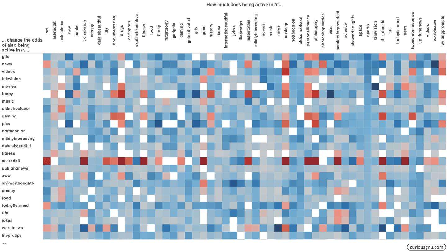
Additionally, I also made a table from the same data. The software programs I used to create both graphs are Gephi and Tableau respectively. A blue square stands for a positive correlation coefficient whereas a red square represents the opposite. You can open the full table by clicking on the graph below:
Admittedly, these aren’t exactly groundbreaking results, but it was real fun to try out some statistical methods on this huge amount of data. I’m currently testing how I can use this data source for an article about text analysis.