Today’s blog post is a visualization of traffic collisions in New York City. The New York Police Departmentpublishes information about motor vehicle collisions on the official NYC OpenData platform. The dataset contains nearly one million incidents going back to the year 2012. For the following visualizations, I only looked at accidents that occurred during the year 2016 in Manhattan (n=36,680).
My first idea was to display all last year’s collisions on an animated map. For this type of task, CARTO (formerly CartoDB) is an excellent freemium service that allows users to create custom maps. Usually, you can upload the OpenData CSV files directly to CARTO; however, for one-fifth of the incidents, no GPS coordinates are provided, and only streets or intersections are given. This lack of information makes a process called geocoding necessary, which transforms postal addresses to geographic coordinates. Due to the relatively large sample size (n=6,301), the free geocoding option of CARTO wasn’t sufficient, so I used the website, Geocodio, which offers a very affordable pay-as-you-go plan. For this map, I differentiated between collisions that lead to material damage or personal injury.
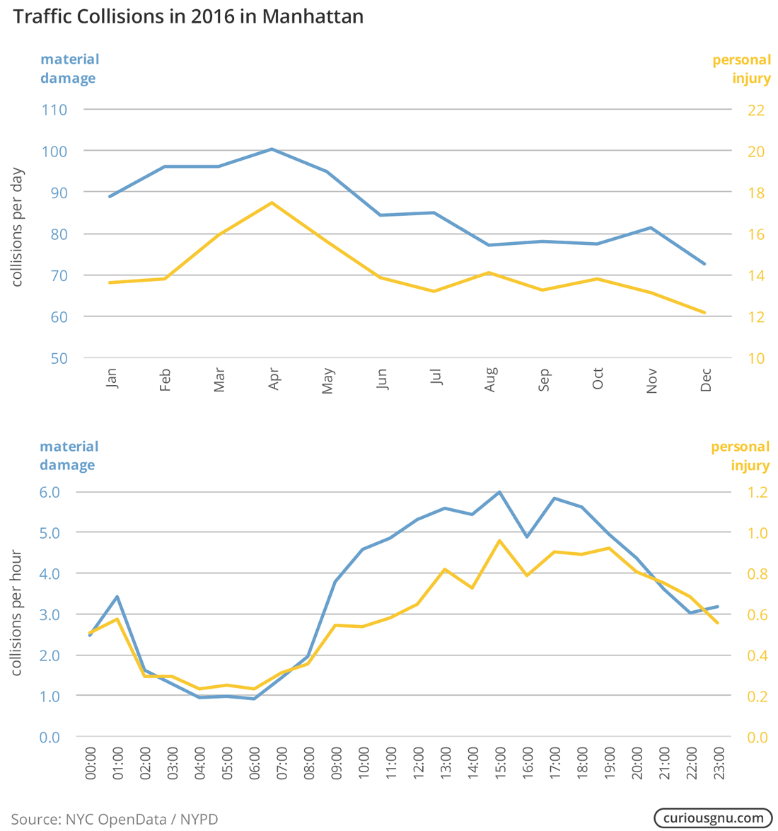
Aside from this, we can of course also use the data for other types of plots. The following line plots compare the number of collisions between times of day and months.
In addition to these simple visualizations, it could be interesting to check how the weather affects the number of accidents (climatological data). If you have questions, feel free to write me an email.