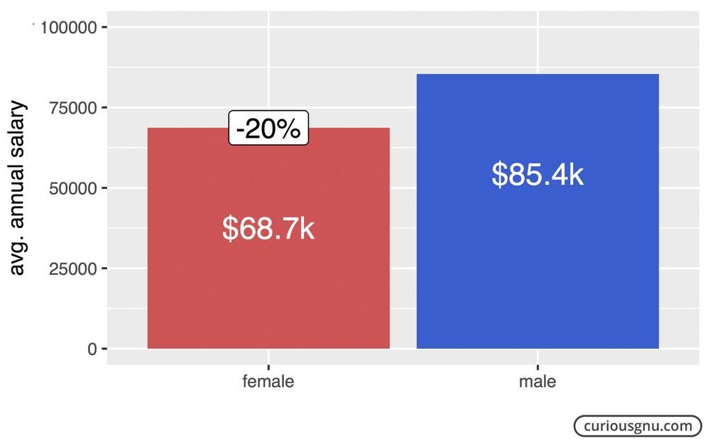
While I was browsing through the City of Chicago’s Data Catalog, I came across a dataset of the city’s 32,000 employees which included their full names, position titles, and annual salaries. I thought that it was a great opportunity to find out whether the gender pay gap was a problem there also. The gender pay gap is the average difference between men’s and women’s earnings, which in the US is somewhere around -21% for women. It is an important number many politicians and activists use as proof for gender inequality.
Before I could compare the average salaries of female and male city employees, I needed to identify their gender – a piece of information which was not included in the official dataset. To do this, I used the R-Package gender to predict the gender of a person based on his or her first name. Of course, this method isn’t 100% accurate, but because of the high number of employees, this potential inaccuracy shouldn’t be a problem. After that, I was able to compare the average annual salaries of male and female city employees. It turns out that the City of Chicago isn’t any better than the rest of the nation. It pays its female employees on average, only 80% of what their male colleagues make – which is very close to the national average of 79%.
If you think now that there are many other factors besides gender, that determine a person’s salary, and that chart above is completely useless, you are right. It’s obviously not good enough to compare only the average earnings of both genders if they do different kinds of jobs. The criticism of how the gender pay gap is used in political discussions isn’t something new, and it has been proven many times that the gender pay gap isn’t a sufficient proof for gender inequality.
I think one of the problems with the arguments against the gender pay gap is that they often rely on statistical tests. Don’t get me wrong, these tests are the only scientifically correct way to do it; but unfortunately, many people stop listening to you as soon as you start mentioning t-tests and confidence levels. The reason why I find the Chicago dataset so interesting is that it contains the salaries of each employee, which allows us to use it as a real-world example to illustrate the problems with the gender pay gap argument. To do this, I propose a simple scatter plot to display the average male and female salaries per position title.
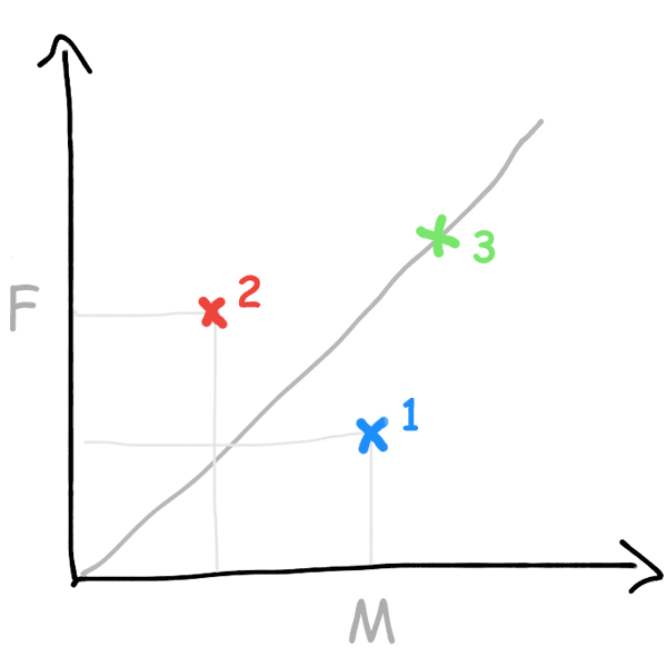
So, each dot represents one job position, like police officer or police sergeant. If a dot (1) is below the 45-degree line, the average salary of men is higher than the average salary of women holding the same position. If a dot (2) is above the 45-degree line, it’s the other way around. In case the average salaries of both genders are equal, the dot (3) sits directly on the line. Based on this idea, I generated the following plot:
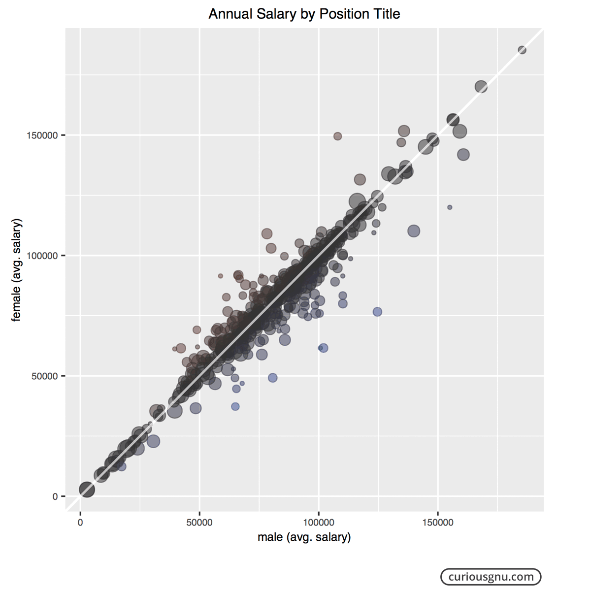
This plot clearly shows that women are not systematically paid 20% less for doing the same job as the first bar chart might have suggested. The main reason for the difference is that women are doing different jobs than men do. Therefore, the gender pay gap shouldn’t be used as an argument for the existence of gender inequality but gender differences. I’m not saying that gender discrimination doesn’t exist in the workplace, it’s just that the gender pay gap doesn’t support the claim that women are paid 20% less for doing the same job. Therefore, a more honest way to use this statistic would be in a discussion about how both gender and personal choices affect careers.
In conclusion, it’s true that the gender pay gap exists, and that on average, women make less money than men. However, the claims that it proves gender inequality are false because women are simply doing different kinds of jobs.
If you have questions or concerns, feel free to write me an email.
Photo: “Chicago” by Tony Webster is licensed under CC BY 2.0